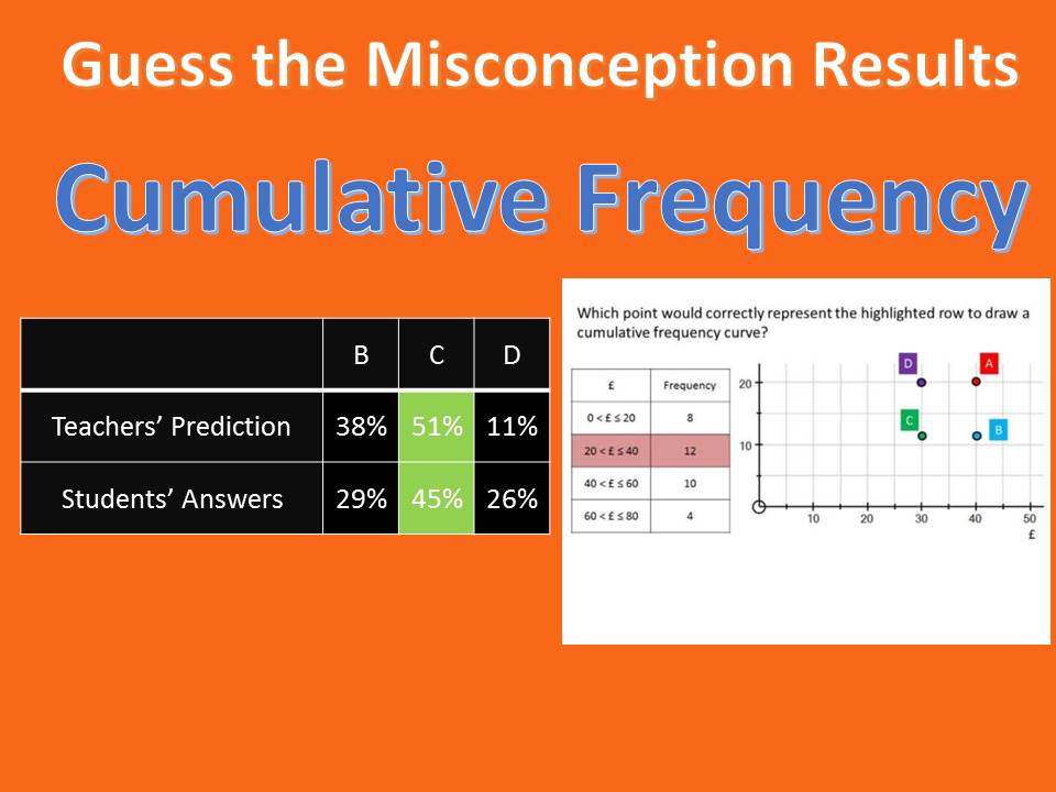
Last week’s question on plotting a Cumulative Frequency Diagram was one of the worst answered questions across the whole of the free daily GCSE Revision Stream to date, with less than 40% of students answering it correctly. This proportion was true across our own Year 11s, despite the fact that we must have covered cumulative frequency diagrams approximately 54 million times over the last few years.
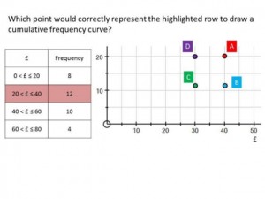
Let’s have a reminder of the question, and a look at how the students answered it:
The majority of incorrect responses by students were split across B and C. We can delve into students’ explanations to discover why.
Answer C
There were two groups of students here – those who had not read the question, and those who have two key misconceptions:
“The cost across the x-axis has cumulative values and so median of these values is appropriate to use for the scale. The median of the inequality value 20<£≤40 is 30. The point on the graph must have 30 as it’s x-coordinate. We are told directly that it’s y value is 12 as that is it’s frequency and the label for the y-axis is frequency. The coordinates of the point that would correctly that would represent the highlighted row to draw a cumulative frequency are (30, 12) and the only point with that coordinate is C.”
“Because the coordinates are 30 across, because the placement needs to be between 20 and 40, and up 12, which of course is the frequency”
“because you plot the midpoint and the frequency and on the graph we can see that 12 (frequency) has been plotted and so has 30 which is the mid point.”
Answer B
Here we have students remembering the importance of the upper boundary, but cumulative frequency has been neglected:
“Cumulative frequency graphs are always plotted using the highest value in each group of data. This is because the table gives you the total that are less than the upper boundary and the cumulative frequency is always plotted up a graph, as frequency is plotted upwards.”
“because in the intervals 20 to 40 you plot the last number = 40 and that is plotted on the x axis while the frequency of 12 is plotted on y.”
“On a cumulative frequency curve you use the highest amount so in this example 40 on the x axis then go up the a,punt of the frequency so 12”
So, what do we take from this? Well, on the bright side, you can make the case that the presentation of the question is not similar to how students would see it in the exam, so no need to panic. However, we have all seen students make these kinds of mistakes. So, at the very least, I believe it is worth showing this question to your Year 11s and just having a quick discussion about each of the incorrect answers to double-check that their knowledge is secure.
With the GCSE Maths exams getting closer, now is the perfect time to sign your Year 11s students up to the free daily GCSE Revision Stream. Over 10,000 students around the country cannot be wrong ![]()

